Get apps your way: The single-app option now on Setapp
For nine years, Setapp has been known as a subscription service where you get hundreds of apps for one simple price. Some people loved the idea. Others preferred to keep buying apps one by one.
Now we want to reintroduce ourselves to them.
We’re welcoming a new option: single-app subscriptions. It’s for people who prefer to get apps, just like they do when they buy directly from a developer’s store. It’s also for those who want to know their money goes to the apps they actually use.
Simply put, it’s for users who want to get apps the way they want to.
So, what is the single-app option?
The idea of 250+ curated apps for one price can feel overwhelming for those who rely on just one or a few essential tools. On the other side, there are developers who wanted to join Setapp but preferred a more individual revenue model.
That’s why we decided to add a single-app subscription option that allows users and developers to personalize their experience.
For developers, the single-app option makes Setapp feel closer to a direct relationship with their users. At the same time, developers benefit from being part of a curated marketplace, using Setapp’s billing infrastructure, and getting user acquisition support. At launch, over 60 developers, including popular apps like Downie or CleanMyMac, have already joined the single-app model, with more apps being added on a rolling basis.
For users, now they can get an app in the Setapp Marketplace the same way they could get it from the developer, with options including monthly or yearly subscriptions or a one-time purchase when available. Plus, users don’t need to wonder, “Where did I even buy this?” since all their apps will be in one account.
See the instructions for subscription or one-time purchase.
Not an endless store. Only apps worth your time and money
Setapp is not just a subscription service; it’s a handpicked marketplace where people go to find good apps for their Mac. This year, we’re making Setapp more flexible for both users and developers, with more apps and more ways to access them. But one thing won’t change: our standards.
We don’t accept just anything. Each app is reviewed and tested before it joins Setapp. And every app that enters the marketplace comes with automatic updates, no ads, and no in-app purchases.
However, we offer flexibility in switching subscriptions, too. Users can always come back to the well-known Setapp membership if paying for a few apps starts to add up.
If you haven’t tried getting apps “the Setapp way,” this is the perfect time. Start your 7-day free trial, and we’ll help you find apps you’ll want to keep using.
But if you prefer to subscribe to apps your way, then take a look at the list and enjoy.
Setapp’s business model and philosophy
Setapp was created and is owned by MacPaw, a Ukraine-based software company best known for its app, CleanMyMac. Learn more about who owns Setapp.
The platform was founded on the idea of simplifying Mac app discovery. Setapp allows users to access a wide range of high-quality Mac and iOS tools for a predictable subscription fee, eliminating the need for individual purchases, licenses, or upgrade fees.
Setapp maintains strict quality standards and curates its app collection. It vets all software for security, quality, and usefulness.
A significant portion of the subscription revenue is shared with developers based on how much their apps are used. This approach provides a stable monetization stream for indie and small developers.
Setapp news and milestones timeline through the years
Here’s a quick look at some of the key milestones that shaped Setapp’s journey over the years.
2016
MacPaw Foundation founded: MacPaw, Setapp’s parent company, established its foundation to support innovation and community projects. MacPaw Foundation is dedicated to supporting Ukraine by providing non-lethal aid.
Idea conception: Oleksandr Kosovan, CEO of MacPaw, proposed the subscription platform concept.
Platform development begins: Work started on building the Setapp platform.
App partnerships: Over six months were spent securing agreements with 40+ apps for the beta release.
Setapp beta: Closed beta launched for press, opinion leaders, and influencers.
Setapp beta for users: Invite-only beta opened to users, attracting 30,000 signups in under two months.
2017
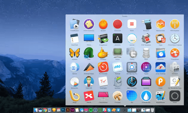
- January: Official public launch of Setapp featuring 61 curated Mac apps.
- June:
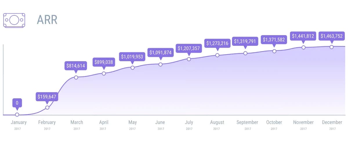
Achieved over $1 million ARR within six months of launch.
Mac Developer Survey 2017 revealed widespread dissatisfaction with the Mac App Store. Most developers earned more outside it, cited issues like the 30% revenue cut and lack of trials, and rated it poorly with a Net Promoter Score of -34.
July: Introduced an annual subscription plan with a 10% discount for yearly payments.
August:
Co-hosted WWDC party with Paddle at The Tech Museum, San Jose.
Expanded to French, German, and Brazilian Portuguese.
Redesigned account management interface.
September: Added Spanish language support.
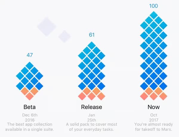
November: Library reached 100 apps along with the smart recommendation system, powered by machine learning to enhance user experience.
December:
Reached $1.5M ARR and 300,000 users.
Setapp won multiple awards, including Product Hunt’s Golden Kitty Award for Consumer Product of the Year.
The team added support for the Italian language.
Here’s what a Setapp user, Nathan Farrell, shared:
2018
January: Setapp celebrated its first anniversary.
February:
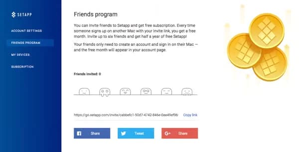
Friends Program referral system launched, offering free months to both parties.
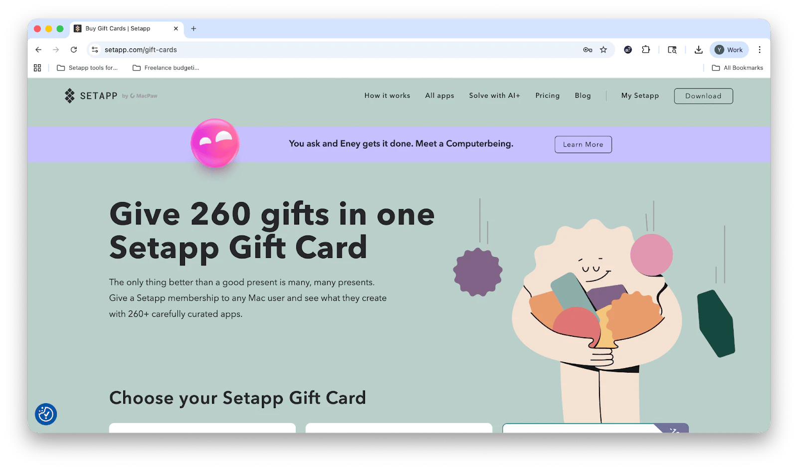
Gift Cards for Setapp subscription launched. It allows you to gift a Setapp membership with 260+ carefully curated apps to any Mac user.
March: Setapp was nominated for the SXSW Interactive Innovation Award in the New Economy category.
April: Setapp platform won the Great User Experience 2018 and Rising Star 2018 awards from FinancesOnline.
October:
Setapp got shortlisted for Best SaaS Newcomer at the SaaS Awards.
Mac Market Survey 2018 showed that most developers earned more outside the Mac App Store, with many still frustrated by its lack of upgrade options, analytics, and free trials. Though overall opinions slightly improved after Apple’s macOS Mojave updates.
2019
January: Second anniversary celebrated with new features. Setap now supports up to 5 Macs per account.
February:
Setapp was named one of Fast Company’s Top 10 Most Innovative Companies in Europe.
Mac Developer Survey 2019 revealed that most Mac developers earned more outside the Mac App Store, showed growing interest in Setapp distribution, and viewed subscription models as beneficial despite mixed revenue results.
- May: Setapp 2.0 was released, featuring a rebranded website, a redesigned desktop app, new categorization, and a transparent logo.
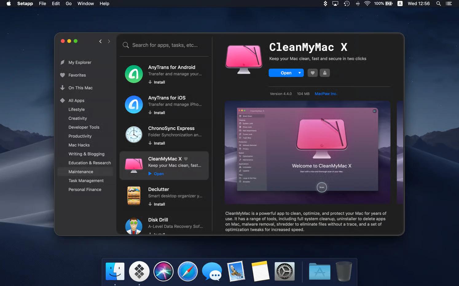
June: Setapp participated in WWDC 2019: attended SJMacIndie, hosted its own event with Paddle, and CEO Kosovan spoke at AltConf.

Oleksandr Kosovan, CEO of MacPaw Source: podfeet.com
September:
Setapp won Best SaaS Product for Productivity (non-US) at the SaaS Awards.
Updated the platform to be compatible with macOS Catalina.
- November: Beta launch of Setapp for Teams, a subscription plan that gives entire teams access to Setapp’s full library of Mac and iOS apps with centralized billing, user management, and shared licenses.
2020
January:
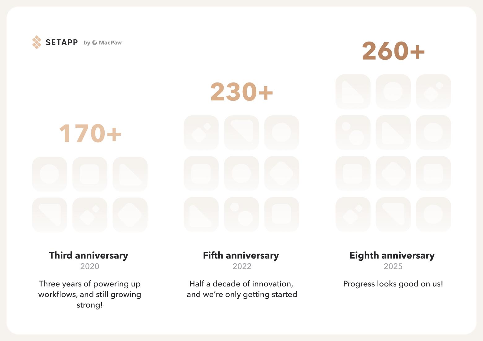
Setapp celebrated its third anniversary, and the app catalog exceeded 170 Mac utilities.
Setapp team published The Ultimate Mac User Book, a comprehensive guide that walks readers through the entire Mac experience — from basic setup to advanced workflows.

* The Ultimate Mac User Book is not available for purchase anymore.
June:
Setapp hosted Decoding the Keynote virtual meetup during WWDC.
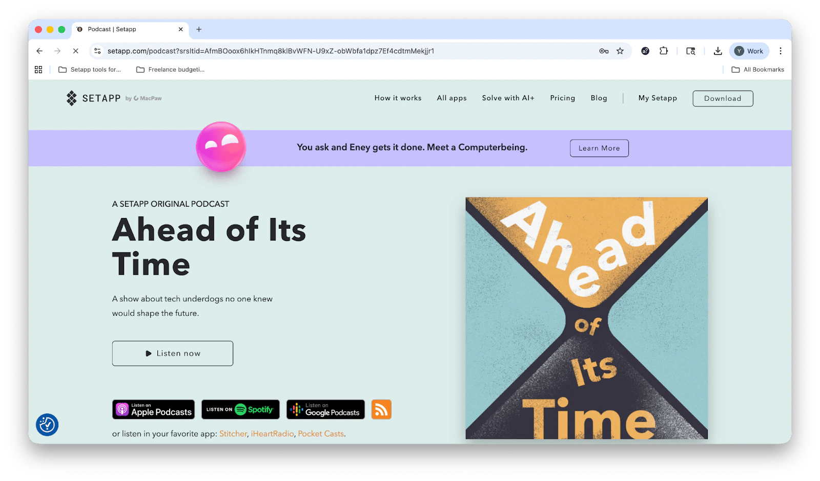
Setapp launched the podcast “Ahead of Its Time,” an original show by Setapp about tech underdogs who unexpectedly shape the future.
August:
The platform expanded device support to 4 additional Macs.
Setapp expanded to iOS with a curated selection of compatible iPhone apps (see the complete list of iOS apps available on Setapp).
October: Relaunched the referral program, rewarding both the referrer and the invitee.
November:
Released Setapp for Teams, which lets you access Setapp’s full library of Mac and iOS apps with centralized billing and management.
Setapp won Most Exciting Collaboration Application at the Noonies 2020 award.
2021
January: Setapp celebrated its fourth anniversary, and the library grew to over 220 apps.
February: Mac Developer Survey 2020 showed developers’ optimism for 2021, strong approval of Apple’s Small Business Program (90% satisfaction), and resilience in adapting to challenges brought by COVID-19.
May: Mac Apps Report 2021 revealed that Mac users value security, performance, and ease of use most, spend about $36 a year on apps, and prefer one-time purchases over subscriptions.
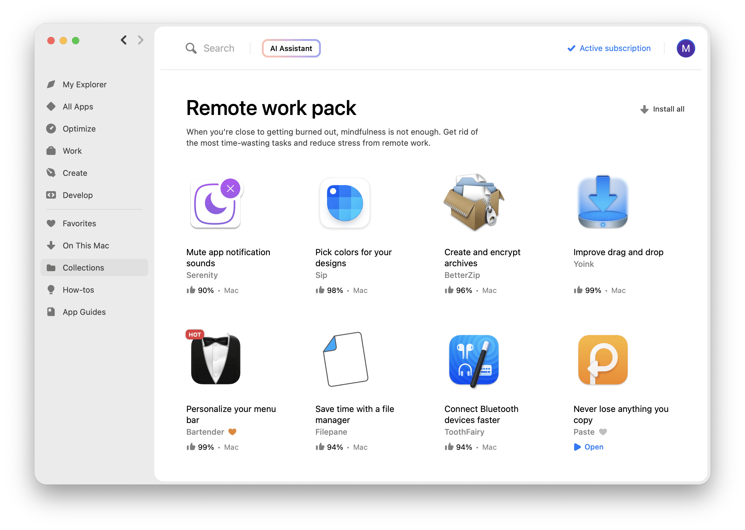
July: Introduced curated app collections — Remote Work Pack, a curated collection of apps designed to help remote teams stay productive, connected, and organized while working from anywhere.
- September: Launched Setapp Stories, a weekly curated newsletter with user testimonials, developer spotlights, and blog posts that showcase how people use the Setapp subscription service for Mac and iOS to solve problems and complete tasks.
2022
February:
Setapp passed a SOC 2 Type 1 audit, confirming strong security standards.
Start of russia’s full-scale invasion of Ukraine (MacPaw’s home country).
The team enabled Setapp vendors to donate revenue to aid Ukraine.
MacPaw offered free CleanMyMac to media and reporters covering the war and free ClearVPN access to Ukrainians so they would always have access to trusted sources of information. CleanMyMac and ClearVPN are included in the Setapp subscription.
MacPaw, along with Setapp, raised over $12M, including $1M from global supporters, to aid Ukrainians with relief and life-saving efforts.
March: Setapp terminated services in russia and Belarus as a response to russia’s full-scale invasion.
December:
Mac Developer Survey 2022 showed that Mac users prioritize app features (47%) and security (45%) when choosing apps, still favor one-time purchases (36%) over subscriptions, and value apps that deliver on their purpose while fitting their budget.
Mac Apps Report 2022 revealed that Mac users typically had 37 apps installed (9 paid), spent $139 annually on apps, valued features, security, purpose, and price when buying.
2023
January:
Setapp celebrated its sixth anniversary.
Setapp launched AI+ plans (AI Enthusiast and AI Expert) to simplify the use of AI apps. They offer clear limits, require no API configuration, and have no hidden charges, adhering to their straightforward approach of “download, open, use.” promise.
March: Mac Developer Survey 2023 revealed that 39% of Mac developers have already incorporated ChatGPT into their workflows (with another 41% working on it), 44% have integrated AI/ML models into their apps (and 28% are in progress), 60% are interested in distributing iOS apps outside the App Store.
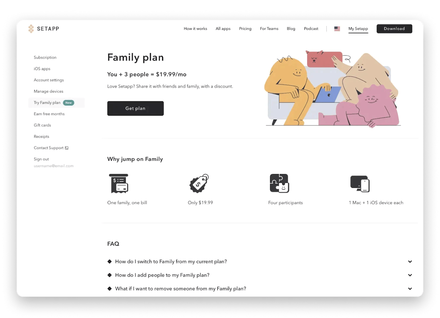
May: Setapp introduced Family Plan, which allows families to simplify their workflows on Mac and iOS devices with just one subscription.
October: Mac Apps Report 2023 released, showing that 42% of Mac users now use AI-powered apps daily, highlighting growing AI adoption, strong preference for subscriptions, and continued loyalty to Mac devices for their performance and reliability.
2024
January: Seventh anniversary marked with the app library expanding to over 240 apps.
December: Mac Developer Survey 2024 showed that 35% of developers have no plans to build for visionOS, while AI integration continues to rise.
September: Setapp Mobile beta release, an alternative iOS app marketplace for EU iPhone users, offering a curated selection of premium productivity and lifestyle apps through a single subscription.
2025
January: Setapp celebrated its eighth anniversary with the platform library expanding to over 260 apps.
February: Write for Setapp launch, a guest author program that invites Apple enthusiasts, developers, and productivity experts to share personal, app-driven stories on the Setapp blog, with editorial support, exposure, and a free month of Setapp access.
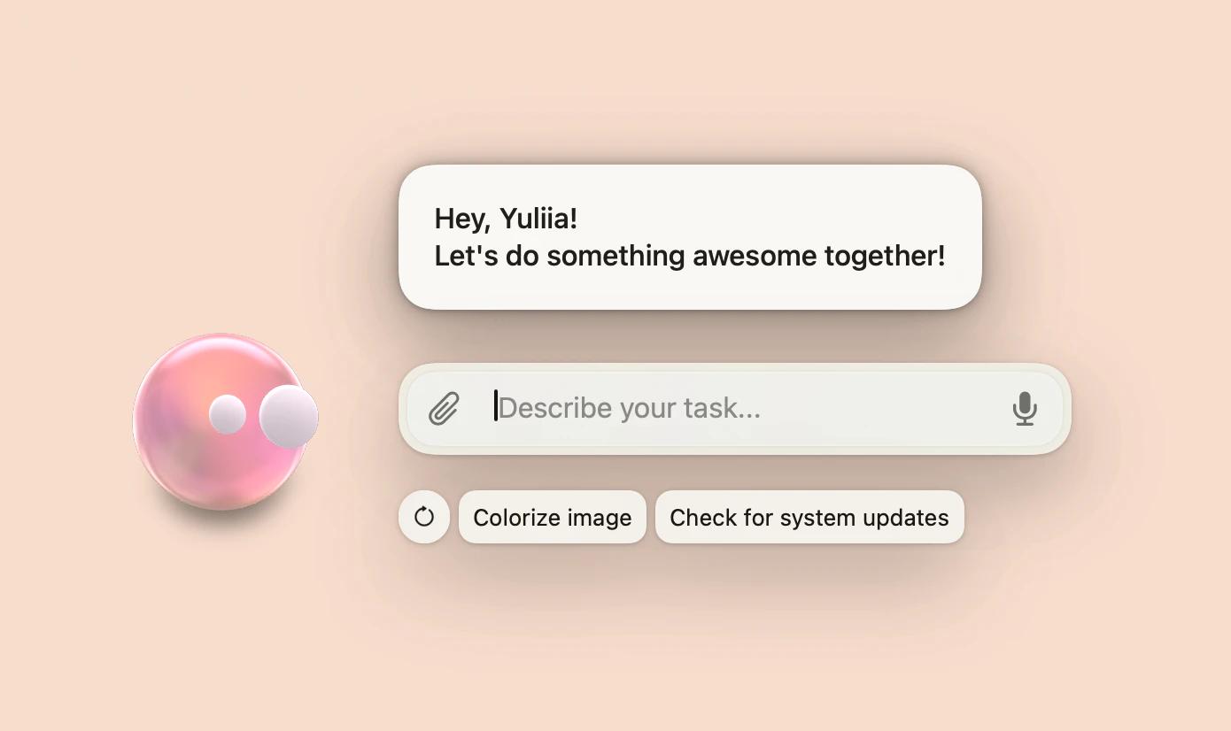
May: Eney Beta release available exclusively by invitation through Setapp. Eney is an AI-powered Computerbeing — an intelligent Mac assistant that understands natural commands, automates tasks across apps, and creates a seamless, human-like way to interact with your computer.
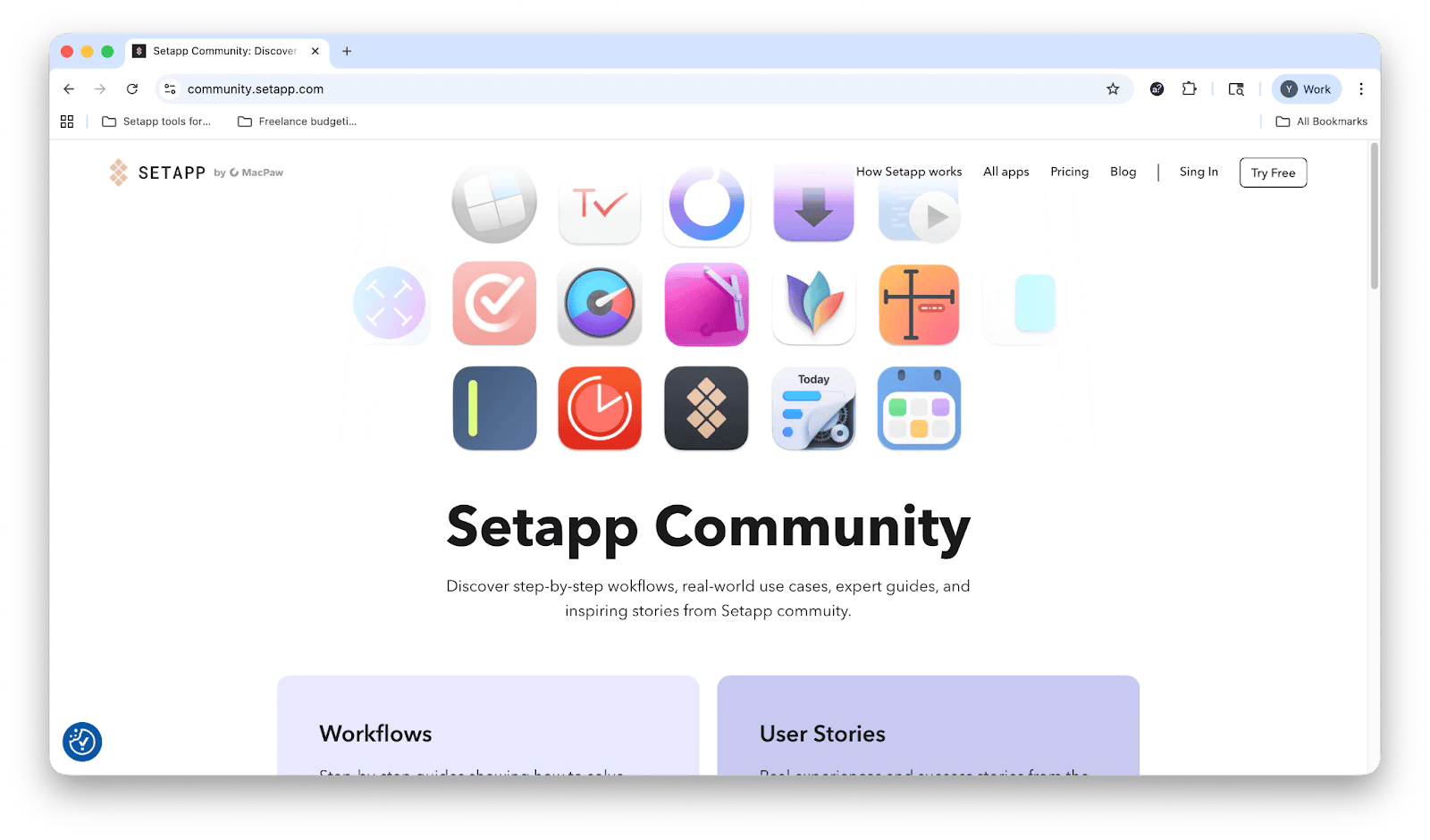
September: Setapp Community launch, a space where Setapp users and experts share step-by-step workflows, real-world use cases, helpful guides, and personal success stories to inspire others and show how to get the most out of Setapp apps.
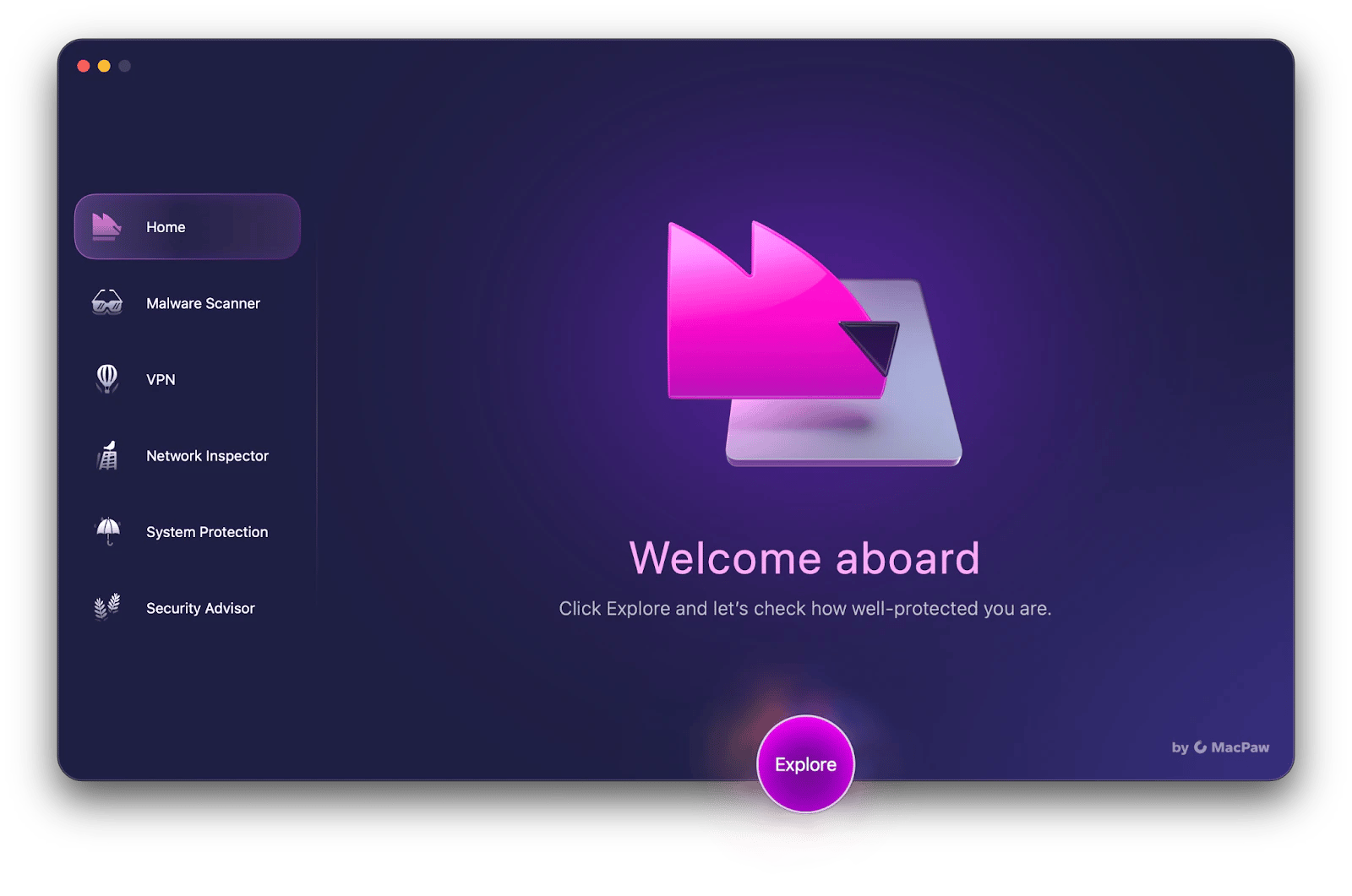
- October: Moonlock was launched and became part of Setapp. Moonlock is a MacPaw’s dedicated cybersecurity app for macOS that offers real-time protection, malware scanning, a built-in VPN, and personalized security guidance to help Mac users stay safe online with simple, human-centered tools.
2026
January: Setapp marked its ninth anniversary, with the platform’s library growing to more than 260 curated apps across macOS, iOS, and the web.
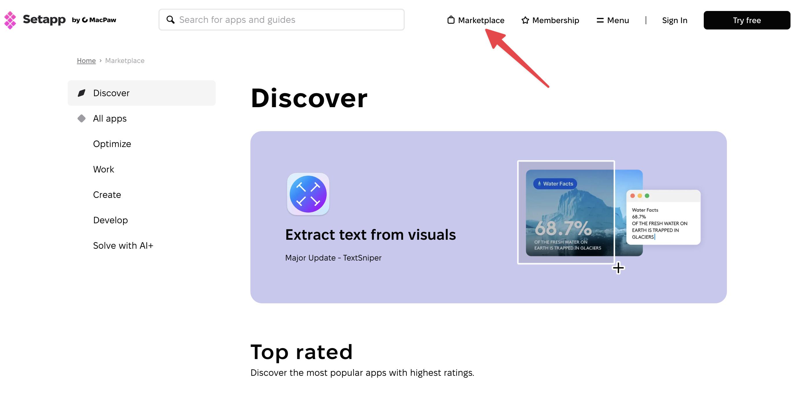
March: Setapp launched Setapp Marketplace alongside Setapp Membership, giving users two ways to access curated apps — either through the full 250+ app library with one subscription, or by buying or subscribing to individual apps with flexible payment options (monthly, yearly, one-time purchase).
What’s next for Setapp?
Setapp’s story is one of constant evolution. What started as a bold idea has grown into a space where over 260 apps work together under one subscription, helping users stay creative, productive, and focused.
If you haven’t explored Setapp yet, now’s a good time to see how far it’s come, and where it’s headed next. You can test all the apps and what they offer with a 7-day free trial.
FAQ
What is Setapp?
Who owns Setapp?
Setapp (created in 2016) is owned by MacPaw, a Ukraine-based software company best known for developing CleanMyMac, Eney, Moonlock, and other innovative Mac tools.
How does Setapp support app developers?
Setapp shares subscription revenue with developers based on app usage. This model gives indie and small developers a predictable income stream and encourages them to keep improving their apps.
What devices can I use Setapp on?
You can use Setapp on Mac and iOS devices, and it also includes access to web apps for flexibility across platforms. See the full list of Setapp apps.
Is there a free trial available?
Yes, new users can try Setapp with a 7-day free trial to explore the full catalog of 260+ apps before subscribing.
How many apps are currently available on Setapp?
As of 2025, Setapp includes over 260 apps across productivity, creativity, utility, and other categories.
