Best free productivity apps to supercharge your workflow in 2026
▼ TL;DR:
- Instead of paying for expensive premium tools, many best free apps for productivity offer robust features. Setapp provides access to premium productivity tools like NotePlan, Timemator, Spark Mail, Ulysses, CleanMyMac alongside 250+ other apps for one subscription price.
- The right combination varies by workflow: combine free tools like Todoist and Slack with Setapp apps like NotePlan and Timemator to create a complete productivity system.
- Tools like ChatGPT, Perplexity, and Spellar AI will help automate routine tasks, and Eney will become a true companion in your work on your Mac!
I work full-time, recently defended my thesis and graduated from business school, work out, run a blog, and am launching my own startup. And yes, I haven't burned out yet and am still in my right mind.
I've simply learned to prioritize tasks, focus, and develop discipline. The best free productivity apps on my Mac help me with this. I know there are many of them on the market, and learning how to use them takes time. So I've done it for you! Read my review, save what resonates with you, and complete your tasks more effectively.
The good news is that these best free apps for productivity are either completely free or included in Setapp for the price of a single subscription.
Let’s compare the best free productivity apps
Guess what's one of the biggest problems with productivity apps? Instead of promoting efficiency, they distract you! Sometimes devs go overboard with the features users need.
“Some productivity apps have endless features that look cool but just get in the way, while others are so minimal they don’t actually help with real organization. The sweet spot is something that’s powerful but still easy to use — where I don’t have to spend more time managing my tasks than actually doing them”, shares Reddit user.
While researching tools, I faced this issue as well. Therefore, my toolkit only includes free productivity apps that genuinely assist in tracking time, automating routines, and managing tasks. So let's take a look at them.
Tool | Category | What for | Best for | Price |
Todoist | Task Management & To-Do Lists | Natural language task creation | Busy professionals, students | Free or Premium from $4/mo |
Asana | Task Management & To-Do Lists | Team task coordination | Small teams, startup founders | Free for individuals |
Task Management & To-Do Lists | Markdown notes + calendar integration | Writers, researchers, freelancers | Included in Setapp | |
Task Management & To-Do Lists | To-do lists creation | Minimalists, habit trackers | Included in Setapp | |
Airtable | Project & Workflow Management | Database-style project tracking | Content creators, project managers | Free for individuals |
Zoho Projects | Project & Workflow Management | Comprehensive project planning | Small business owners, product teams | Free for individuals |
Project & Workflow Management | Visual flowchart task planning | Visual thinkers, complex project planners | Included in Setapp | |
Slack | Communication & Collaboration | Team messaging | Remote teams, distributed workforces | Free |
Miro | Communication & Collaboration | Brainstorming | Creative teams | Free or Pro from €8/mo |
Communication & Collaboration | Smart inbox organization | Email-overwhelmed professionals | Included in Setapp | |
Communication & Collaboration | Distraction-free writing environment | Writers, bloggers, authors | Included in Setapp | |
Clockify | Time Tracking & Scheduling | Simple time logging | Freelancers, consultants | Free or Pro from $4/mo |
Calendly | Time Tracking & Scheduling | Automated meeting booking | Client-facing professionals, coaches | Free for individuals |
Time Tracking & Scheduling | Automatic time tracking | Productivity enthusiasts | Included in Setapp | |
ChatGPT | Automation & AI Tools | General-purpose AI tasks | Content creators, general users | Free or Plus from $20/mo |
Perplexity | Automation & AI Tools | AI-powered research and search | Researchers, fact-checkers | Free or Pro from $20/mo |
Automation & AI Tools | Meeting transcription and insights | Professionals, managers | Included in Setapp | |
Mac productivity | Real-time system monitoring | Real-time system monitoring | Included in Setapp | |
Mac productivity | Get things done on Mac | Mac users who seek automated solutions | Available in a closed beta for Setapp users | |
Mac productivity | Free up Mac space, eliminate duplicate files | All Mac users | Included in Setapp |
Let me walk you through each of these best free apps for productivity and how they fit into a productive workflow.
Not sure which productivity app is right for you? Share your needs with our free custom GPT assistant, and it will pick the best free productivity apps for you in seconds.
Free productivity apps for task management
Todoist: Natural language task management
Best for: Busy professionals handling multiple projects, students.
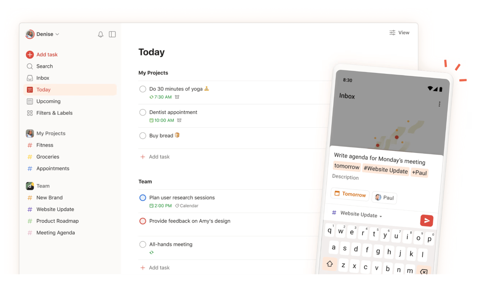
Todoist is one of the best free productivity apps for capturing tasks quickly. I type "email report tomorrow at 2 pm", and Todoist automatically sets the due date and time. The natural language processing saves me from clicking through date pickers.
The free version handles unlimited tasks and projects, which is more than enough for personal productivity. I organize my tasks by project (work, blog, startup, personal) and use priority levels to focus on what matters most.
Best features:
- Natural language processing for instant task creation
- Priority levels (P1-P4) for importance ranking
- Recurring tasks with flexible scheduling
- Project organization with color coding
Pros:
- Natural language task creation saves time
- Cross-platform sync keeps tasks accessible everywhere
- Clean interface reduces visual clutter
Cons:
Advanced features like reminders and labels require a premium
Pricing: Free or from $4/month.
Source: Todoist
Asana: Team-focused task coordination
Best for: Startup founders, managers, content teams.
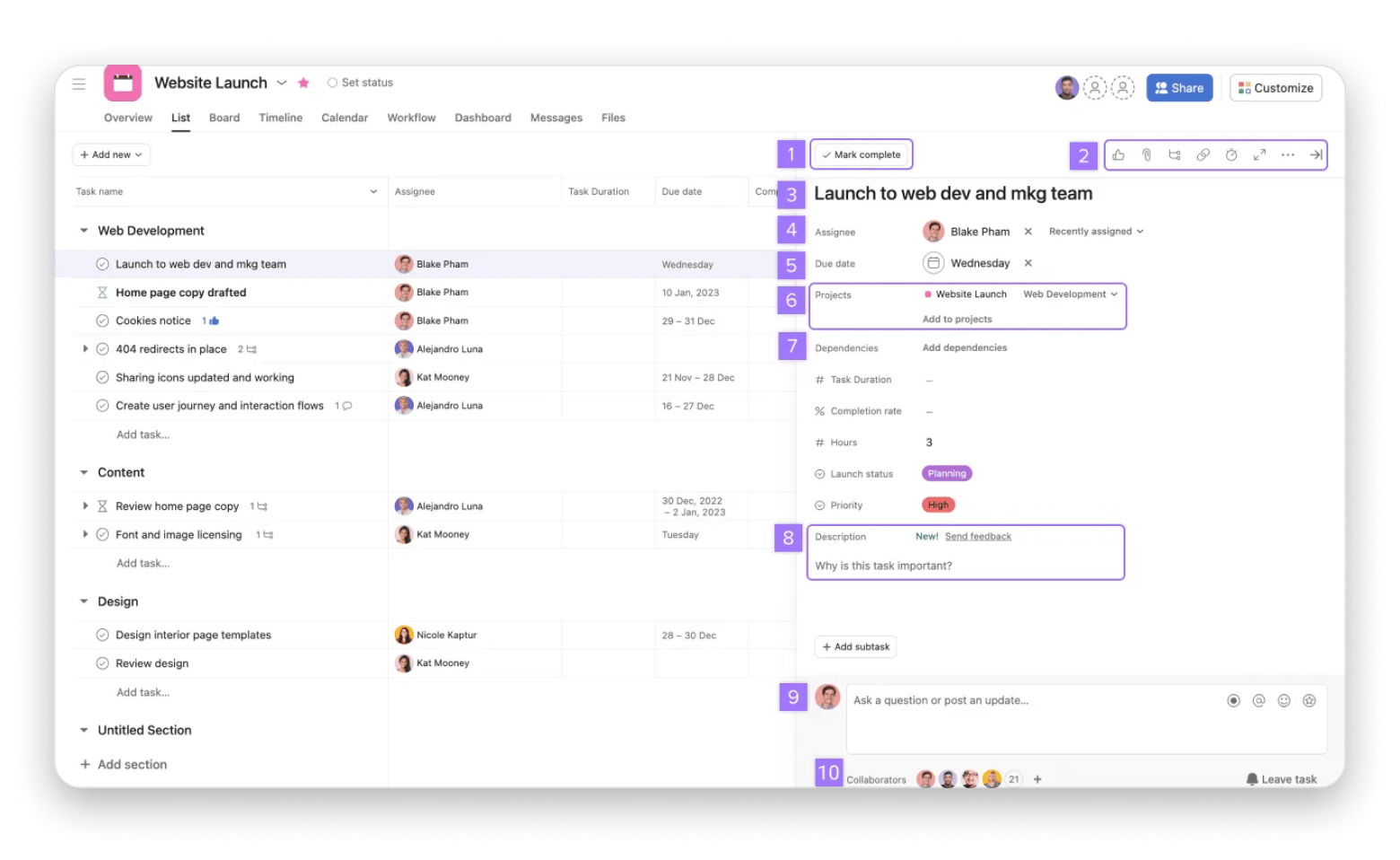
When I need to coordinate with my startup team, Asana handles multi-person task management better than most free apps for productivity. The free version supports up to 10 team members, making it perfect for small teams and early-stage projects.
I use Asana's board view for managing our product development pipeline and list view for tracking blog content deadlines. The ability to assign tasks, set dependencies, and comment directly on tasks keeps everyone aligned without endless email threads.
Best features:
- Assignee and due date tracking for accountability
- In-task comments for contextual discussions
- Custom fields for additional task metadata
Pros:
- Robust free tier for small teams
- Multiple view options (list, board, calendar)
- Task dependencies help plan complex projects
- Integrations with other productivity tools
Cons:
- It can feel overwhelming for simple personal task management
- Timeline view requires a premium subscription
Pricing: Free or from €10.99/month.
Source: Asana
NotePlan: Markdown notes meet calendar integration
Best for: Writers managing long-form projects, researchers, knowledge workers who want notes and tasks unified.
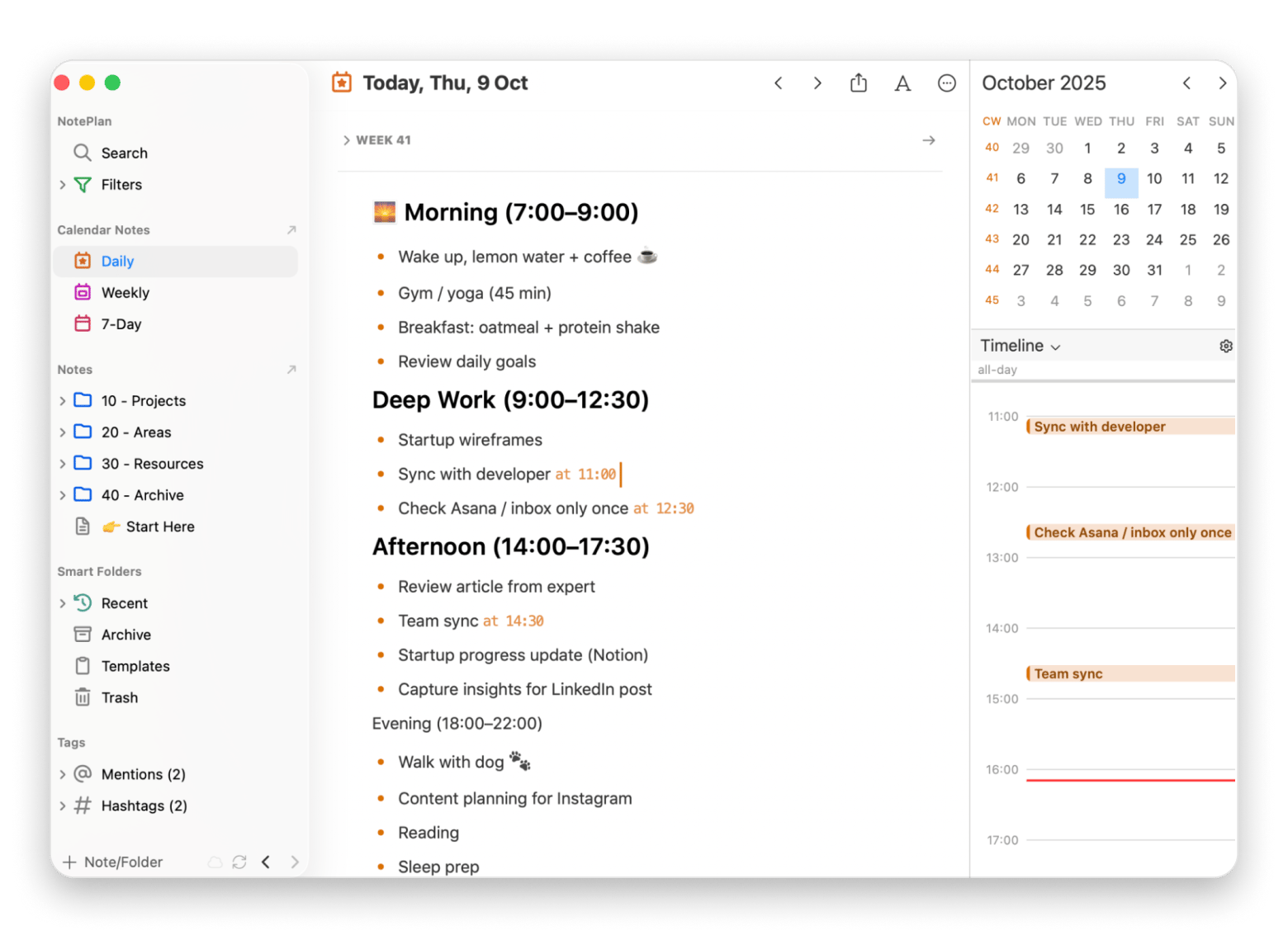
NotePlan combines my notes, tasks, and calendar in one place. Unlike other productivity apps that force you to choose between note-taking and task management, NotePlan lets me write my thesis notes in Markdown and convert action items into tasks with a simple checkbox.
The calendar integration shows my tasks alongside my actual meetings and commitments, giving me a realistic view of what I can actually accomplish each day. When I'm planning my week, I drag tasks from my backlog directly onto specific days.
Best features:
- Markdown formatting for flexible, future-proof notes
- Backlinks for connecting related notes and ideas
- Daily notes with automatic task rollover
Pros:
- Calendar integration provides realistic daily planning
- Backlinks create connections between related notes
- Local storage keeps data private
Cons:
Steeper learning curve than simple to-do apps
Pricing: Available on Setapp, a platform with 250+ apps for Mac, iPhone, and iPad. Install as many apps as you want for the price of a single subscription.
“I've tried many todo and project apps, but Noteplan seems to match how my brain works best”, shares Noel, musician, a Setapp user.
Godspeed: Minimalist to-do tracking
Best for: Minimalists who want simple daily task completion.
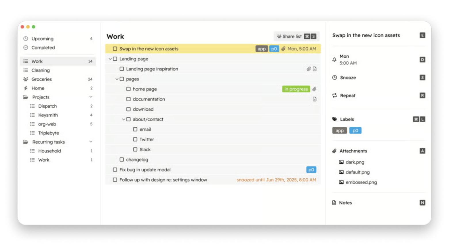
When I need to focus without distractions, Godspeed provides the simplest interface among free productivity apps. It lives in my menu bar and shows only what I need to do today — no fancy features, no overwhelming options.
I use Godspeed for my morning workout routine and daily writing goals. The minimalist approach helps me stay focused on completion rather than organization.
Best features:
- Natural language date entry
- Quick Entry mode with global hotkey for on-the-go capture
- Labels and infinite task nesting for organization
- Smart lists to filter tasks by labels
- Email-to-task functionality (each list has a dedicated email address)
Pros:
- Zero learning curve - just add tasks and check them off
- Menu bar access keeps tasks visible without switching apps
- Lightweight and fast
- Perfect for daily habit tracking
Cons:
Limited to simple task lists
Pricing: Available on Setapp, a platform with 250+ apps for Mac, iPhone, and iPad. Install as many apps as you want for the price of a single subscription.
Here’s what Reddit user says about Godspeed:
“I’ve used a ton of apps to track tasks in a GTD-inspired system on the Mac, from Org-mode in eMacs to Omnifocus. In between, I used Nozbe, Obsidian, LogSeq, Notion, so many others. I discovered Godspeed by chance and am finding it to be a perfect blend of things I loved about all of the other apps”.
Best free productivity apps for project management
Airtable: Database-powered project tracking
Best for: Content creators managing editorial calendars, project managers, small teams needing flexible databases without technical setup.
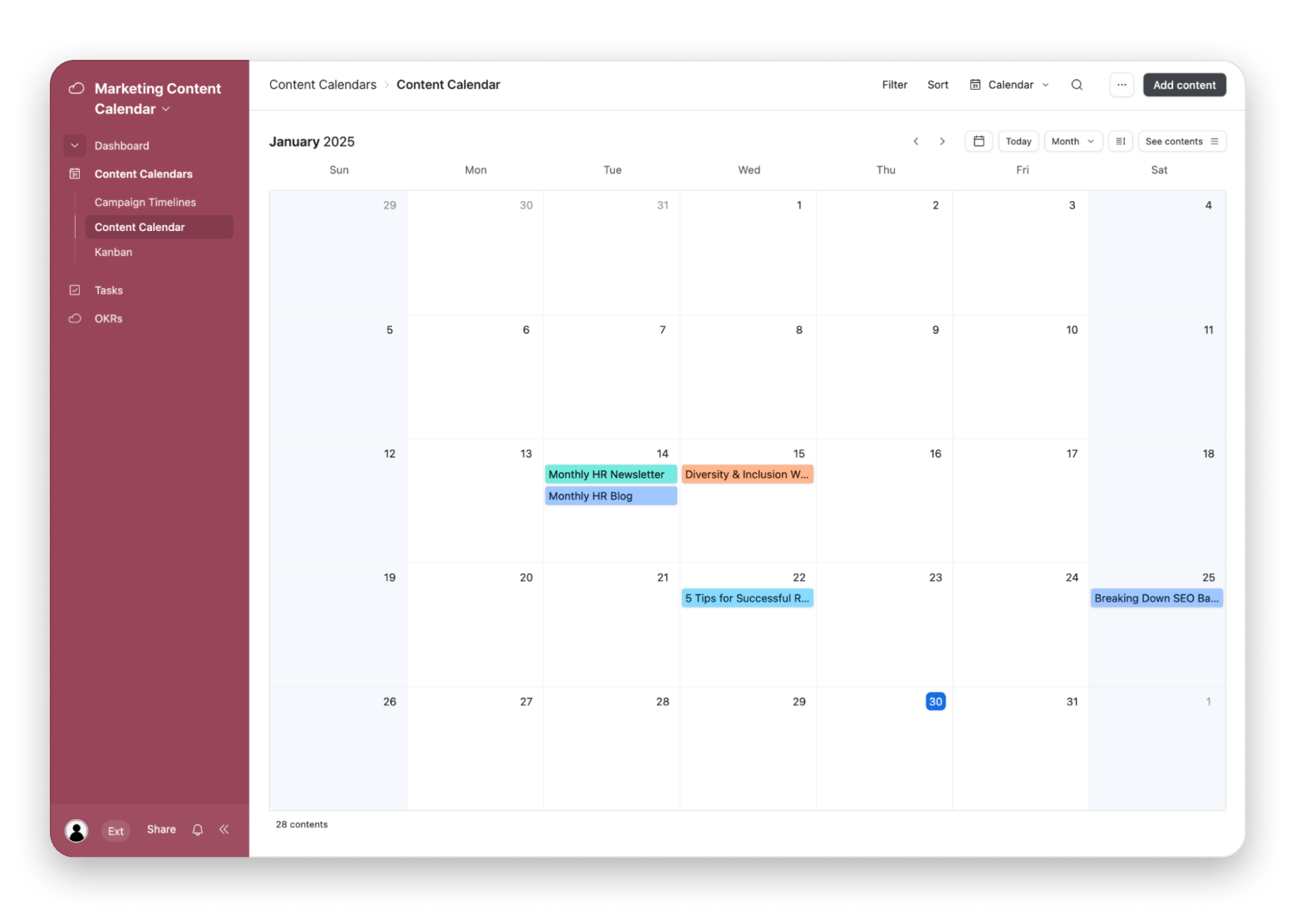
In our content team, Airtable is an indispensable tool for managing our blog calendar. While it looks like a spreadsheet, it's actually a powerful database that we customize for different workflows. We track article ideas, research sources, publication dates, and SEO keywords all in one base.
The free productivity app version includes unlimited bases with up to 1,000 records each, which handles my blog content planning for years. I use different views - gallery view for visual content planning, calendar view for publication scheduling, and Kanban view for tracking article status.
Best features:
- Multiple view types (grid, calendar, gallery, Kanban, form)
- Rich field types (attachments, links, ratings, checkboxes)
- Customizable filters and sorting
- Collaboration with comments and mentions
- Template gallery for quick setup
Pros:
- Flexible database structure adapts to any workflow
- Rich field types including attachments and links
- Collaboration features in free tier
Cons:
- Complexity can be overwhelming initially
- 1,000 record limit may constrain larger projects
Pricing: Free or from $20/month.
Source: Airtable
Zoho Projects: Comprehensive project planning
Best for: Small business owners managing client projects, product teams coordinating development sprints.
If you are engaged in product development, Zoho Projects provides enterprise-level project management for free. The free tier supports three projects with unlimited tasks.
Use Gantt charts to visualize your development timeline, milestones to track major releases, and task dependencies to ensure nothing blocks your progress. The time tracking integration helps to understand how long features actually take to build.
Best features:
- Gantt charts for visual timeline planning
- Milestone tracking for major deliverables
- Task dependencies and critical path analysis
- Built-in time tracking and timesheets
- Document storage and version control
Pros:
- Comprehensive features in free tier
- Time tracking integration
- Document storage and collaboration
Cons:
- Only three projects in free version
- Interface feels busy compared to modern alternatives
Pricing: Free or from €4/month.
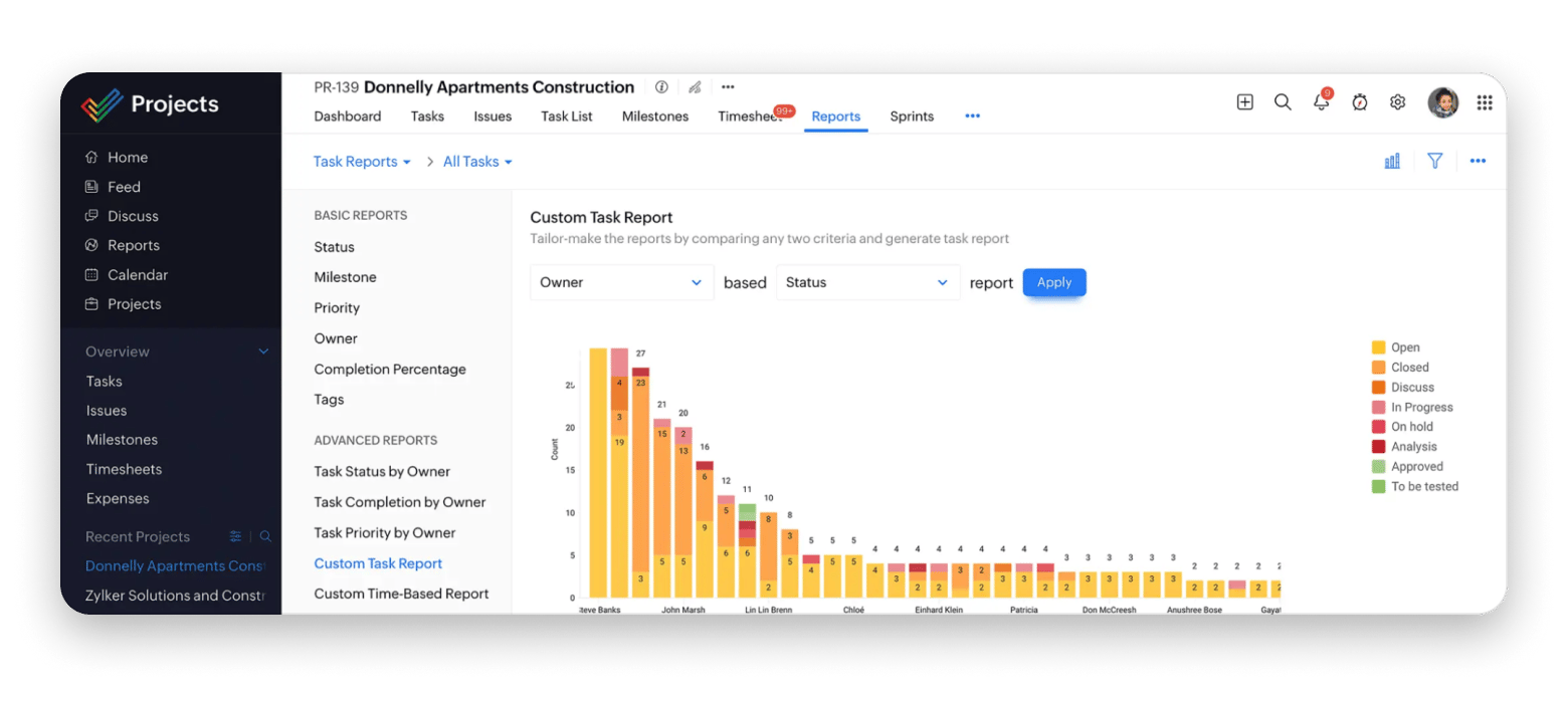
Source: Zoho
Taskheat: Visual flowchart planning
Best for: Visual thinkers, project managers, anyone preparing for major milestones (weddings, product launches, academic defenses).
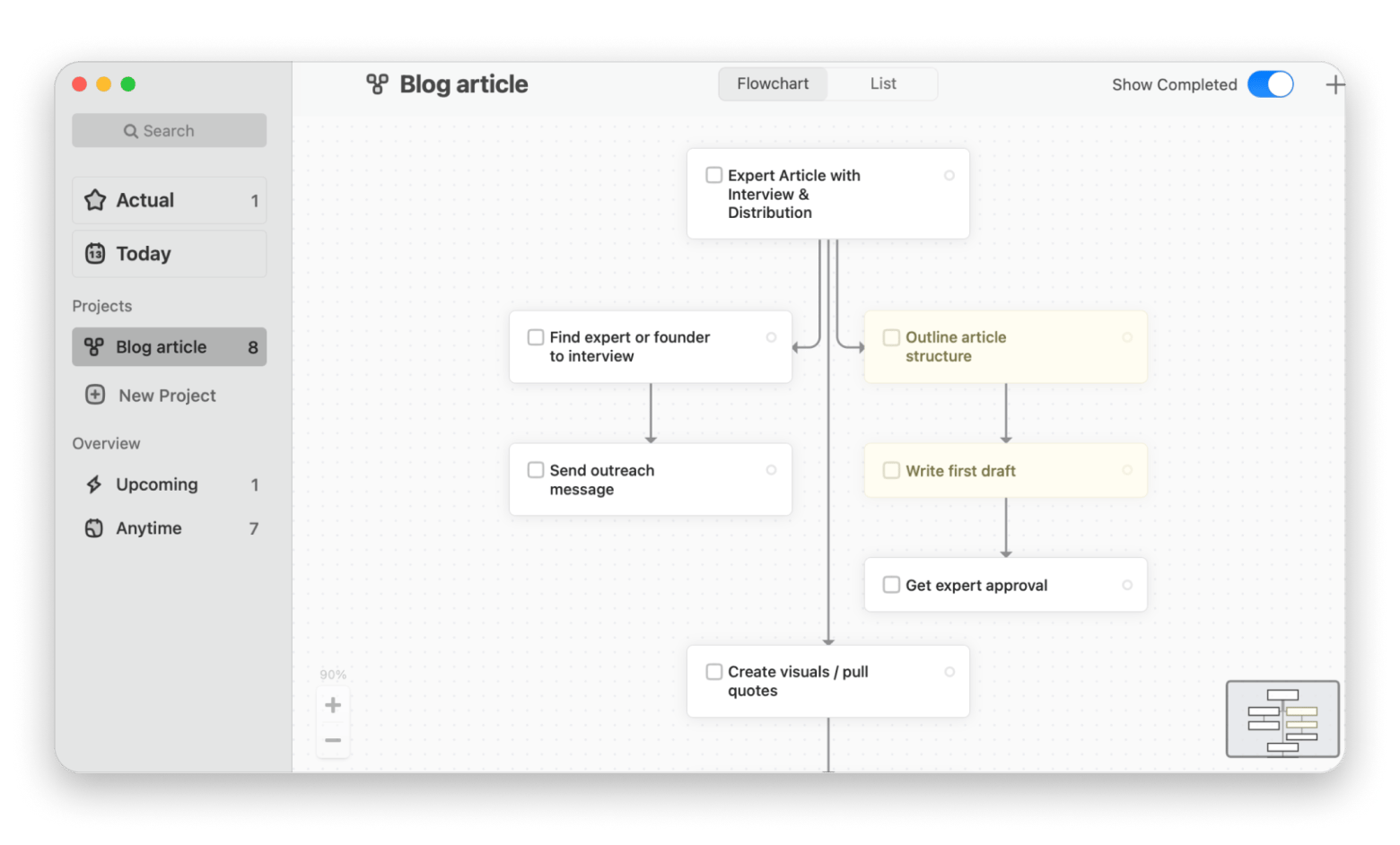
I am a visual person, and it is easier for me to plan when I see flowcharts instead of just linear task lists. That's why I use Taskheat. It is a free productivity app where you can visualize preparation steps, showing which tasks blocked others and which could happen in parallel.
The visual approach helps me spot bottlenecks in preparing articles for the blog or launching an MVP startup. I can see at a glance what I'm missing and avoid working in chaos.
“Very innovative. This is as of MindMeister and Notes have a baby. I can already see how this can help with my own daily productivity workflow! Instant buy”, says Reddit user.
Best features:
- Visual flowchart interface for task relationships
- Color-coded task status and priorities
- Tags for categorizing related tasks
Pros:
- Shows task dependencies and relationships clearly
- Helps identify parallel work opportunities
- Great for complex project planning
Cons:
Takes longer to set up than traditional to-do apps
Pricing: Available on Setapp, a platform with 250+ apps for Mac, iPhone, and iPad. Install as many apps as you want for the price of a single subscription.
Free productivity apps for communication
Slack: Team messaging without email overload
Best for: Teams needing organized communication
I may be annoyed by notifications in Slack, but I definitely agree that it is the best free productivity app for team collaboration. We communicate in Slack both at my full-time job and with the startup team.
It is handy that you can create a separate discussion for each topic, so conversations stay organized by subject. The free version includes a 90-day message history, which mostly meets our needs. I also like Slack Huddles — no need to open separate software to call a colleague for 10 minutes and discuss a quick question.
Best features:
- Slack Huddles for quick audio conversations
- Searchable message history (90 days on free plan)
- Rich integrations with thousands of tools
Pros:
- Organized channels replace messy email threads
- Searchable history preserves decisions and context
- Real-time communication speeds up collaboration
Cons:
- Can become distracting with constant notifications
- 90-day message limit in free version
Pricing: Free or from $4.38/month (with a 50% off for three months)
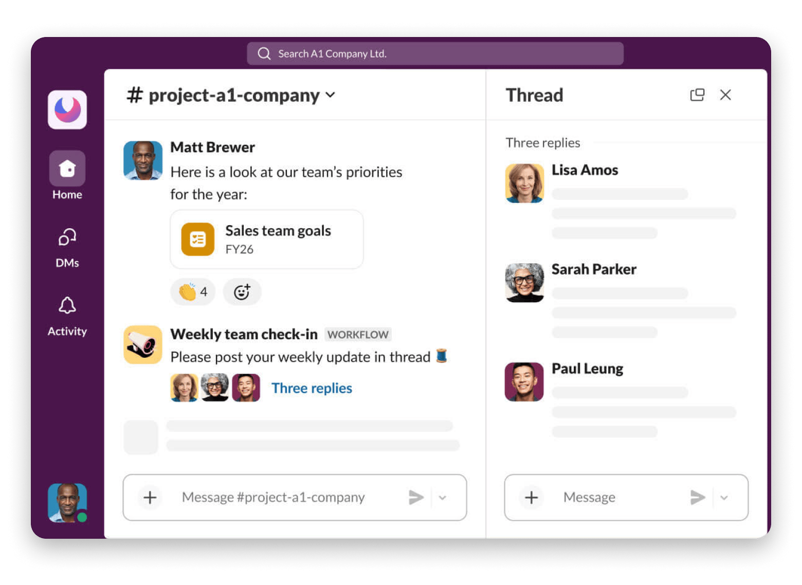
Source: Slack
Miro: Visual brainstorming and planning
Best for: Teams or individuals for brainstorming.
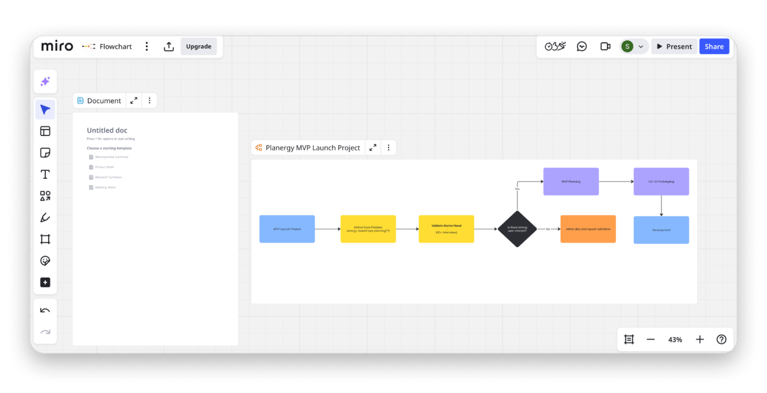
Since I work with different types of content every day, Miro has become a real editorial board for me. I visualize tasks from the idea of an article to writing and distribution, add sticky notes, and group articles by stage (Interview pending / Editing / Published).
We also use Miro in my startup team for brainstorming plan sprints. We create sticky notes for idea generation, flowcharts for user journeys, and wireframes for product planning. Real-time collaboration means everyone can contribute simultaneously during meetings, creating better ideas faster than sequential sharing.
Best features:
- Infinite canvas for unlimited space
- Ready-to-use templates (Kanban, mind maps, wireframes)
- Sticky notes, shapes, arrows, and drawing tools
Pros:
- Real-time collaboration during meetings
- Templates for common workflows
- Intuitive interface requires minimal training
Cons:
- Only three editable boards in the free tier
- Can feel overwhelming with unlimited space
Pricing: Free or from €8/month
Spark Mail: Smart inbox organization
Best for: Anyone drowning in newsletter subscriptions, people who need inbox zero without manual sorting.
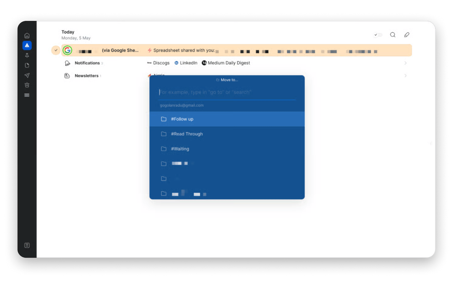
Spark Mail rescued me from email overwhelm. It automatically categorizes messages into personal, newsletters, and notifications, so I can focus on what matters. The smart inbox shows important messages first, pushing newsletters and notifications to separate sections I check later.
I use Spark's quick replies for common responses and snooze feature to defer non-urgent emails. The unified inbox shows all my email accounts (work, blog, personal) in one place without forcing me to switch contexts.
Best features:
- One inbox for multiple email accounts
- Quick replies for common responses
- Email snoozing to handle messages later
- Smart notifications (only for important emails)
Pros:
- Smart categorization reduces inbox clutter
- Unified inbox for multiple accounts
- Clean, modern interface
Cons:
Advanced features require team subscription
Pricing: Available on Setapp, a platform with 250+ apps for Mac, iPhone, and iPad. Install as many apps as you want for the price of a single subscription.
“While using Gmail, I had to log in and out of accounts constantly. As a result, I was missing messages and was always confused about which account I was currently using. Now, I enjoy a seamless experience of using Spark Mail, as I can receive and manage emails from different inboxes (Gmail, AOL, iCloud, Yahoo, and others) in a single account”, shares Stefan-Radu Gogolan, video editor, digital marketing specialist.
Read more:
- Best planner apps for Mac users (AI tools included)
- Best mind mapping software for Mac
- The best to-do list app for Mac
- Setapp workflows for entrepreneurs
Ulysses: Distraction-free writing environment
Best for: Writers, bloggers, authors, students.
I used to write everything in Google Docs and, honestly, wasn't planning on changing anything. Then I discovered Ulysses, and now I only use it to write blog posts, thesis chapters, and startup business plans. The distraction-free interface shows only my words, no formatting toolbars or visual clutter. I write in Markdown, which keeps me focused on content rather than appearance.
The library organizes all my writing projects in one place. I have groups for blog drafts, published articles, thesis chapters, and business documents. The word count goals help me maintain consistent writing output – I set 1,000 words daily, and Ulysses tracks my progress.
Best features:
- Distraction-free fullscreen mode
- Export to multiple formats (PDF, Word, HTML, ePub)
- Integration with WordPress and Medium for quick posting
- Ability to work on writing from a Mac and iPhone — everything syncs up
Pros:
- Distraction-free interface improves focus
- Markdown keeps formatting simple
- Library organization for all writing projects
- Word count goals track productivity
Cons:
Markdown syntax requires learning
Pricing: Available on Setapp, a platform with 250+ apps for Mac, iPhone, and iPad. Install as many apps as you want for the price of a single subscription.
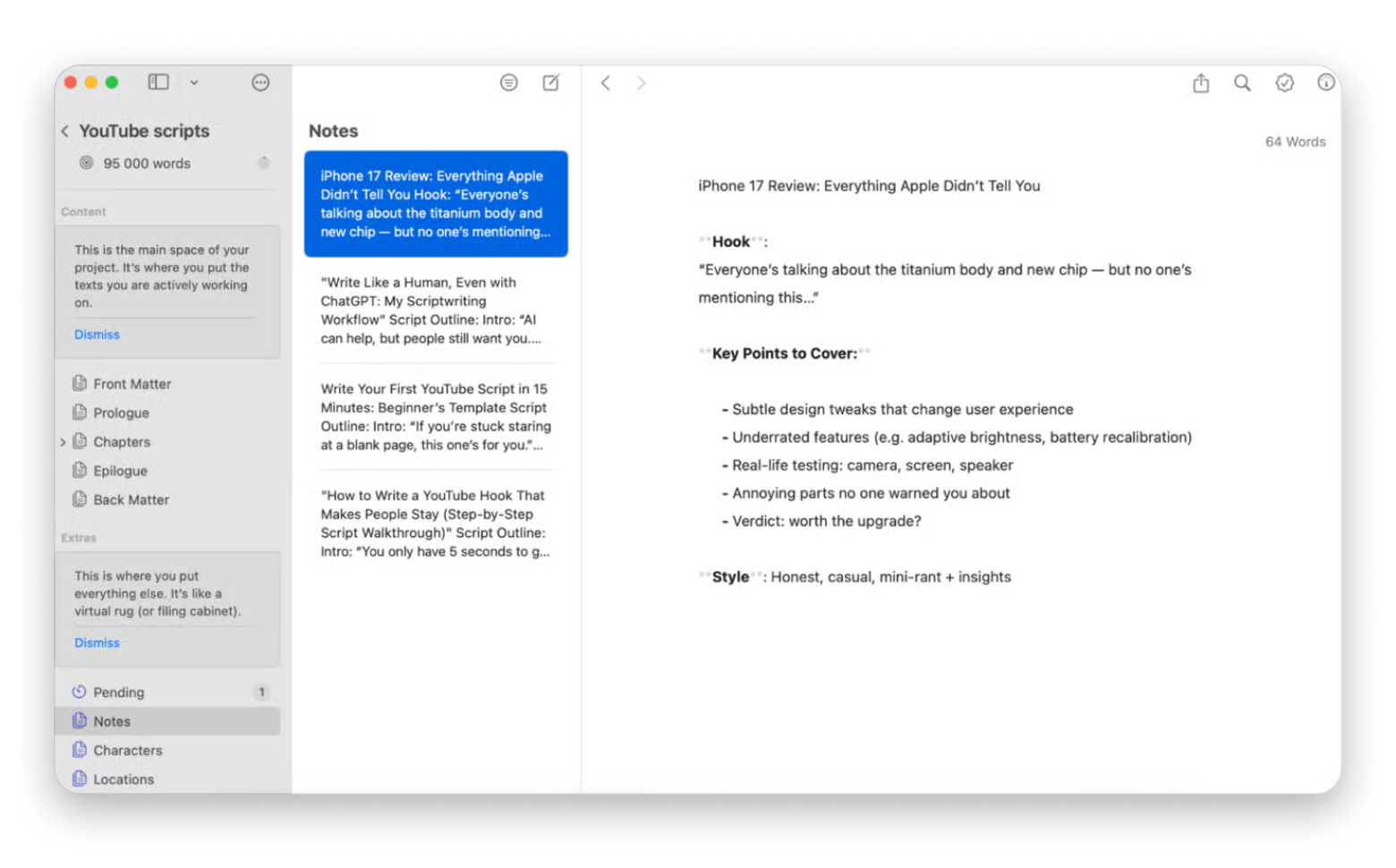
Here’s what Rotten Apple, a tech YouTuber with more than 45k subscribers, loves Ulysses for scriptwriting:
“Ulysses is my absolute bread and butter for script development. Ideas are worthless unless you flesh them out properly. So, I start with a fleshed-out idea and write down exactly what I want to convey in Ulysses. Then, I conduct extensive research, fact-checking, and gathering information that gives my video credibility."
Best free productivity apps for time tracking
Clockify: Simple time logging
Best for: Freelancers tracking billable client hours, consultants, and anyone curious where their time actually goes.
Wondering why it feels like the workday just started, but it's already 3 p.m.? Clockify will help you understand where your time is going. The free version includes unlimited tracking and projects, making it one of the most generous best free productivity apps for time management.
The weekly reports show me I spend more time in meetings than I think and less time on deep work than I should. These insights help me restructure my schedule to protect focus time.
Best features:
- Manual and timer-based time entry
- Detailed reports and analytics
- Calendar view for visualizing time blocks
- Team time tracking and productivity insights
Pros:
- Unlimited time tracking in free version
- Simple interface requires no training
- Reports reveal actual time usage patterns
- Cross-platform sync
Cons:
- Manual start/stop can be forgotten
- Basic reporting compared to premium alternatives
Pricing: Free or from $5.29/month.
![]()
Source: Clockify
Calendly: Automated meeting scheduling
Best for: Coaches, consultants, and salespeople scheduling frequent external meetings.
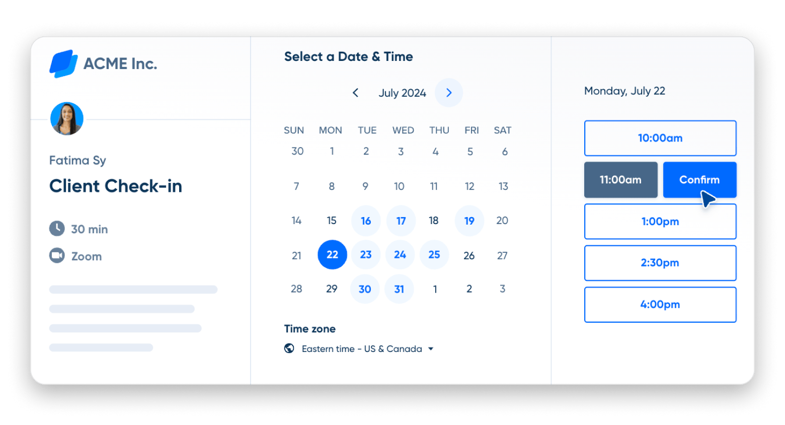
I use Calendly for blog interview scheduling, and it eliminates the "when are you free?" email chains. I just share my Calendly link, people see my available times, and they book directly. The free productivity app version supports one event type with unlimited bookings.
Best features:
- Calendar sync with Google, Outlook, iCloud
- Email and SMS reminders
- Time zone detection
Pros:
- Eliminates scheduling back-and-forth
- Automatic calendar sync prevents conflicts
- Email reminders reduce no-shows
- Professional appearance for client meetings
Cons:
- Only one event type in free version
- Limited customization without premium
Price: Free or from $10/month.
Source: Calendly
Timemator: Automatic time tracking
Best for: Productivity enthusiasts
While Clockify requires manual intervention, Timemator works automatically. And that makes all the difference! It's one of my favorite tools that runs silently and categorizes my time based on application usage. When I'm in my code editor, it logs startup work. When I'm in my writing app, it logs blog time.
The automatic tracking reveals productivity patterns I wouldn't notice otherwise. I discovered I context-switch between tasks every 12 minutes on average — a problem I'm now working to fix with longer focus blocks.
Best features:
- Custom rules for categorizing activities
- Productivity scoring and insights
- Calendar integration showing time blocks
- Privacy-focused with local data storage
Pros:
- Completely automatic - no manual start/stop
- Reveals actual productivity patterns
- App-based categorization
- Minimal effort required
Cons:
Requires some setup for accurate categorization
Pricing: Available on Setapp, a platform with 250+ apps for Mac, iPhone, and iPad. Install as many apps as you want for the price of a single subscription.
![]()
Best apps for Mac productivity
Eney: Mac companion that gets me
Best for: Mac power users tired of app-switching, multitaskers handling repetitive Mac tasks, anyone wanting AI that executes rather than explains.
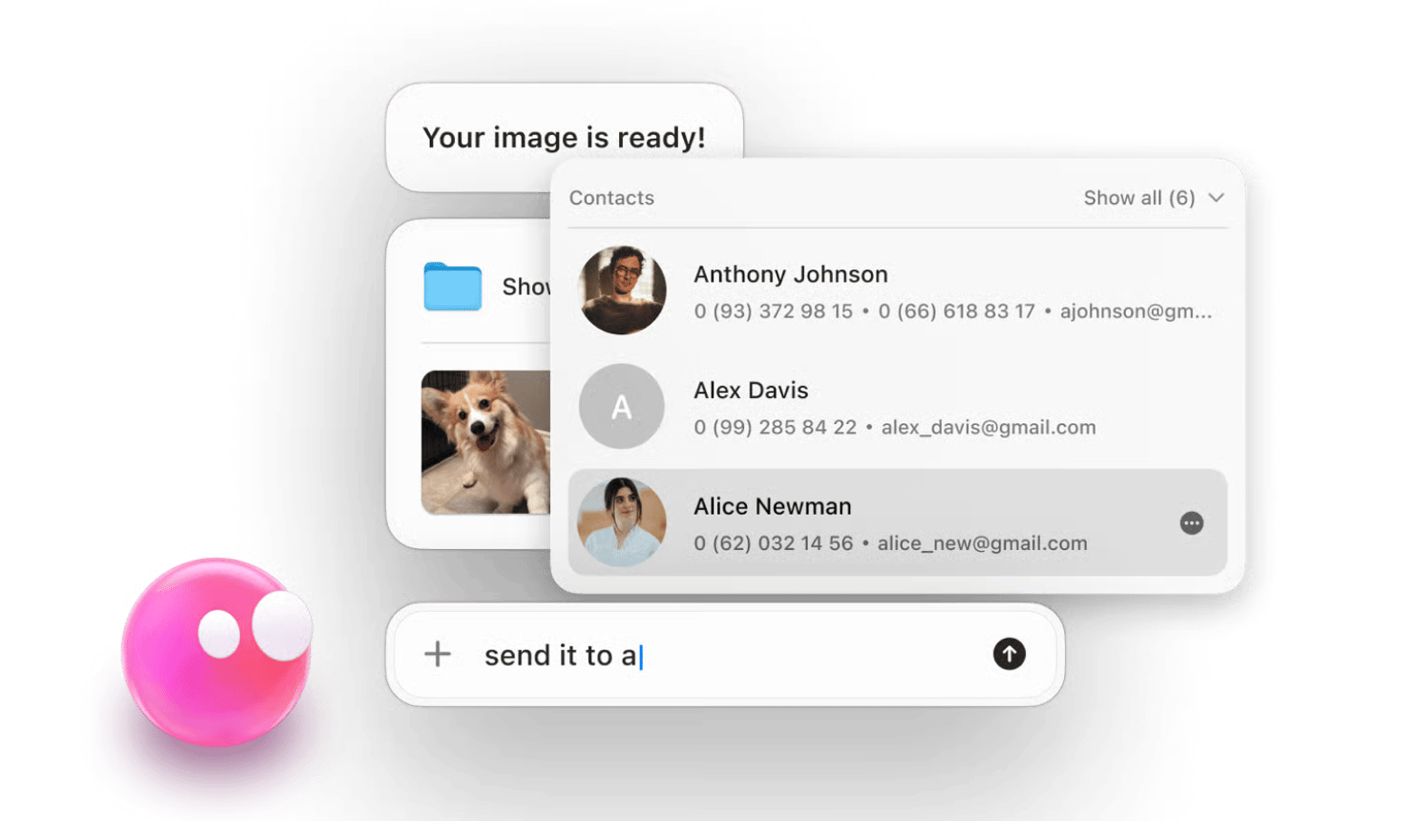
Converting images for my blog, cleaning up my Mac's memory, finding a document, or sending an email — these seemingly minor tasks could take up a lot of time throughout the day. With Eney, all of this can be automated! It's the first Computerbeing that understands what I want to do on my Mac without commands or scripts and just does it. A real game-changer in my work routine.
If you need to perform a complex task, Eney will break it down into several smaller tasks on its own. That is, you don't have to tell it every step — it understands with half a word.
“Eney is a true AI-powered Mac companion that hides quietly on your desktop, but when you need it, it appears instantly and is ready to understand your needs. It learns your habits, preferences, and workload, adapting accordingly. It is also context-aware. If you ask it to find yesterday's photo, it will show it to you immediately!” says Liuda Mekhed, Product Marketing Manager at MacPaw."
Best features:
- Natural conversation interface (no commands needed)
- Executes tasks automatically, not just explains them
- Context-aware understanding of your workflow
- Proactive suggestions based on Mac usage patterns
- Multi-step task automation
Pros:
- Executes tasks instead of providing instructions
- Learns your workflow and provides proactive suggestions
- Context-aware understanding of recent activities
- Friendly, conversational interaction style
- Handles complex multi-step workflows automatically
Cons:
You might forget how to do basic Mac tasks yourself:)
Pricing: Available in a closed beta. You can join the waitlist here.
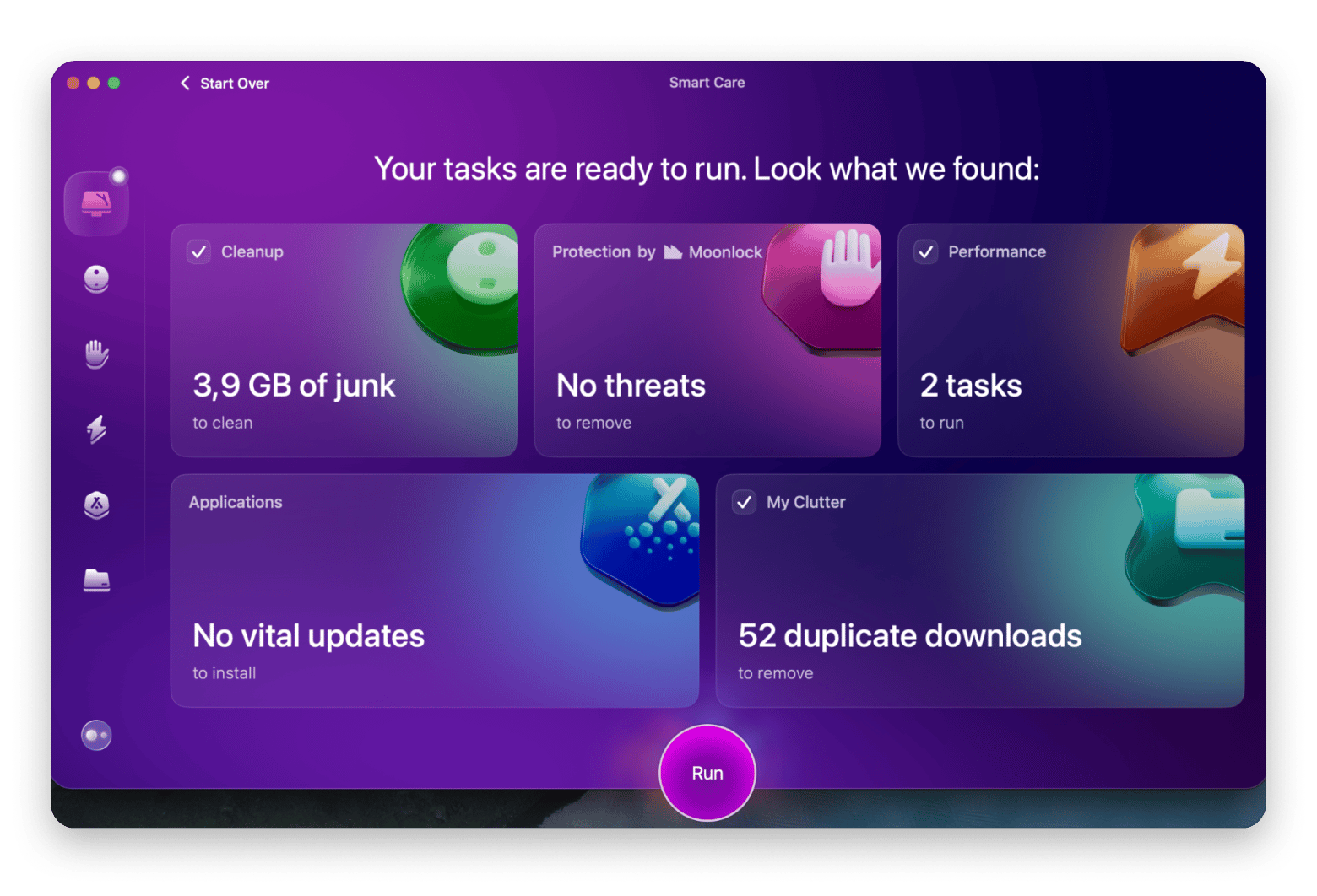
CleanMyMac: System cleanup and maintenance
Best for: All Mac users who want optimal performance.
In case you, like me, never have enough time to clean up your Mac, leave it to one of the best productivity apps out there — CleanMyMac. It removes junk files, clears caches, uninstalls apps completely, and even scans for malware. Regular cleaning with CleanMyMac keeps my Mac running smoothly, which directly impacts my productivity – a slow Mac kills focus.
Best features:
- Smart Scan for quick system cleanup
- Complete app uninstaller (removes leftover files)
- Malware and adware removal
- Large and old files identification
- Optimization scripts for better performance
Pros:
- Comprehensive cleaning in one app
- Simple interface requires no technical knowledge
- Removes malware and security threats
- Complete app uninstallation
- Significantly improves Mac performance
Cons:
Can become overly cautious about what to delete
Pricing: Available on Setapp, a platform with 250+ apps for Mac, iPhone, and iPad. Install as many apps as you want for the price of a single subscription.
“I used to constantly run out of space mid-edit. CleanMyMac now runs weekly in the background, clears up what I don’t need, and keeps my Mac running like new,” shares Thomas, NighTech Channel creator."
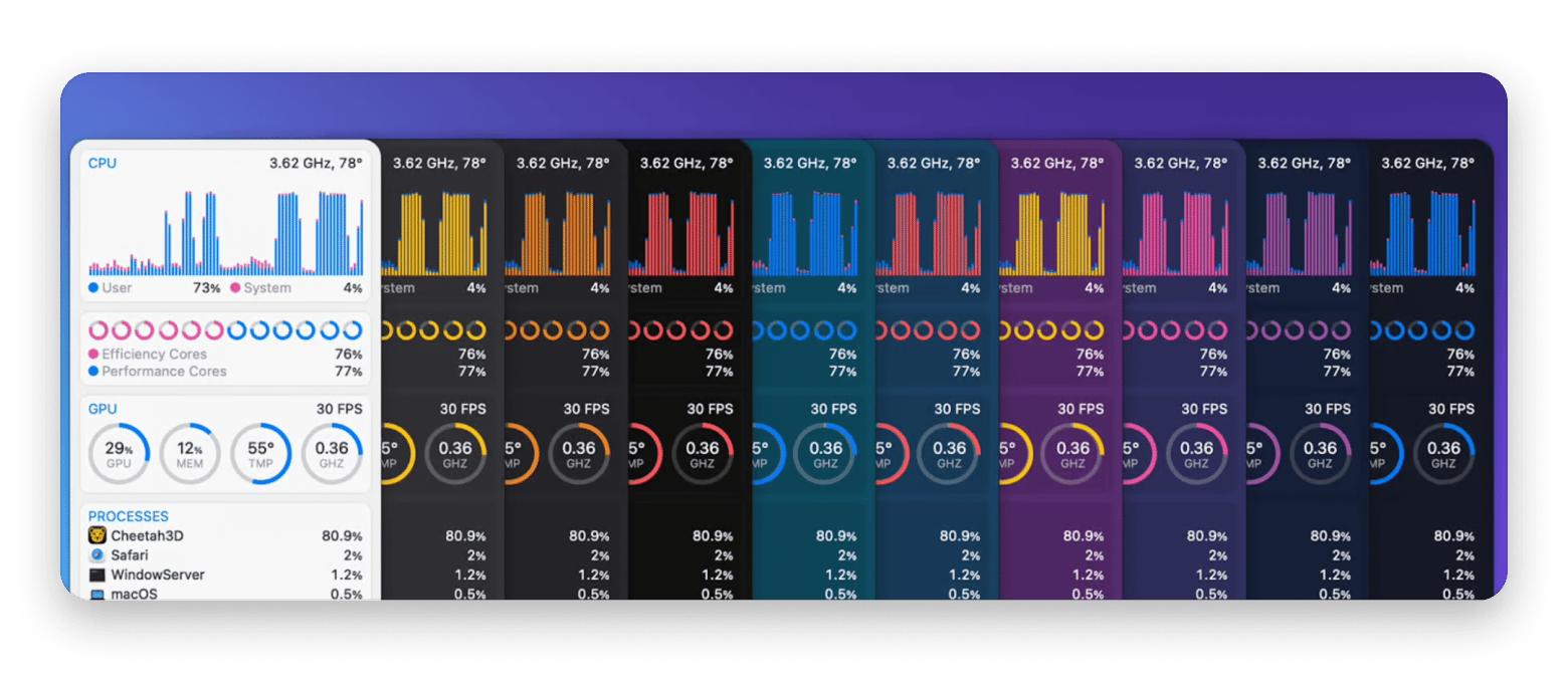
iStat Menus: Real-time system monitoring
Best for: Power users, developers, content creators running intensive apps (video editing, 3D rendering).
iStat Menus lives in my menu bar, showing real-time stats about my Mac's performance. CPU usage, memory pressure, network activity, disk space - everything I need to know about my system's health appears at a glance.
With iStat Menus, I can monitor system performance during intensive tasks, such as video editing. This productivity app also shows me which resource-heavy apps are slowing down my Mac. As a result, I can prevent Mac slowdowns before they happen and know that my laptop won't freeze at a critical moment.
Best features:
- CPU & GPU monitoring
- Network monitoring
- Live temperature monitoring (CPU, GPU, hard drives), fan speed control with custom rules, voltage and power tracking
- Memory stats – pie chart or bar graph views, list of top memory-consuming apps for quick identification
Pros:
- Comprehensive real-time system monitoring
- Highly customizable menu bar display
- Helps identify performance bottlenecks before they impact work
- Fan control prevents overheating during intensive tasks
Cons:
- Can become an obsessive distraction checking stats constantly
- Information overload for casual users who don't need deep metrics
Pricing: Available on Setapp, a platform with 250+ apps for Mac, iPhone, and iPad. Install as many apps as you want for the price of a single subscription.
“Video editing is resource-intensive. iStat Menus sits in my menu bar showing me exactly how hard my Mac is working. When I see CPU usage spiking, I know it's time to close some background apps before my rendering fails. It's saved me from losing hours of work countless times", shares Javier, Minimalis Tech Channel creator.
Free AI-powered productivity apps for automation
ChatGPT: General-purpose AI assistant
Best for: Creators, students, marketers, entrepreneurs.
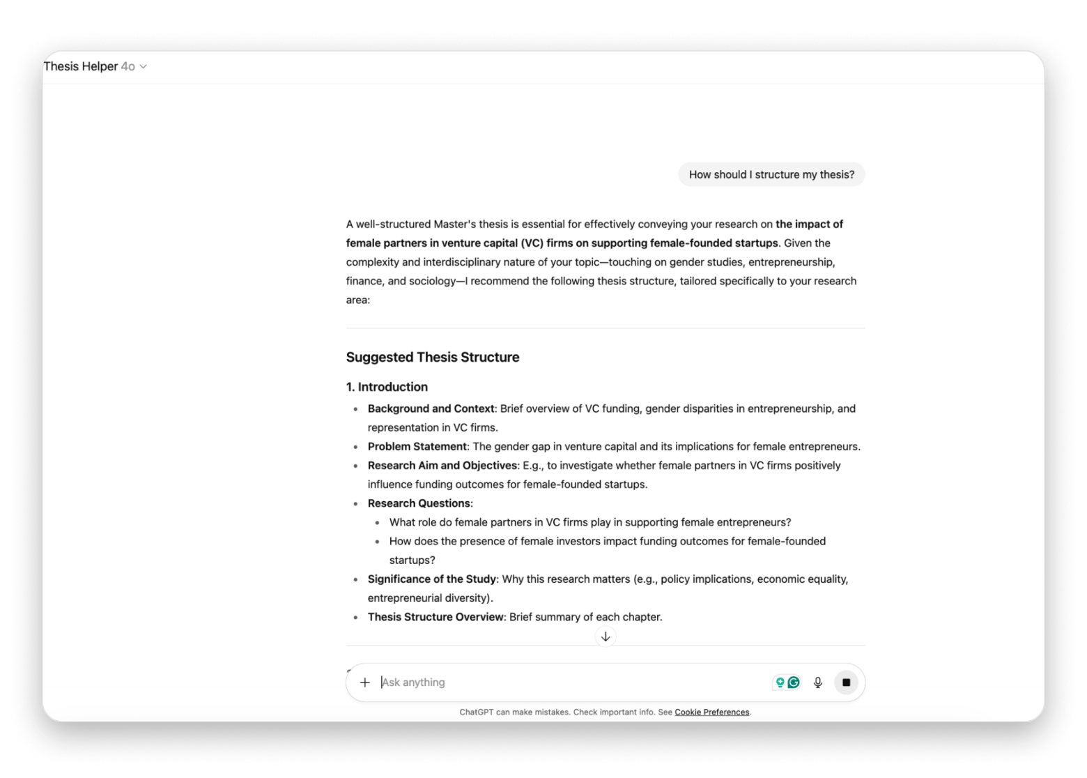
ChatGPT became essential to my productivity workflow. I use it for drafting email responses, brainstorming blog topics, debugging code for my startup, and even outlining thesis chapters.
I've created custom prompts for common tasks like "blog outline generator," "email polisher," and "meeting notes summarizer." These prompts turn ChatGPT into specialized productivity tools without switching between different apps.
Best features:
- Versatile AI assistant for multiple tasks
- Text summarization and rewriting
- Brainstorming and creative ideation
Pros:
- Free tier provides substantial capability
- Improves output quality across writing tasks
- Reduces time on routine communication
Cons:
- Responses require fact-checking and editing
- Free tier has usage limits during peak times
Pricing: Free or from $20/month.
Perplexity: AI-powered research assistant
Best for: Researchers, fact-checkers, content creators, writers..
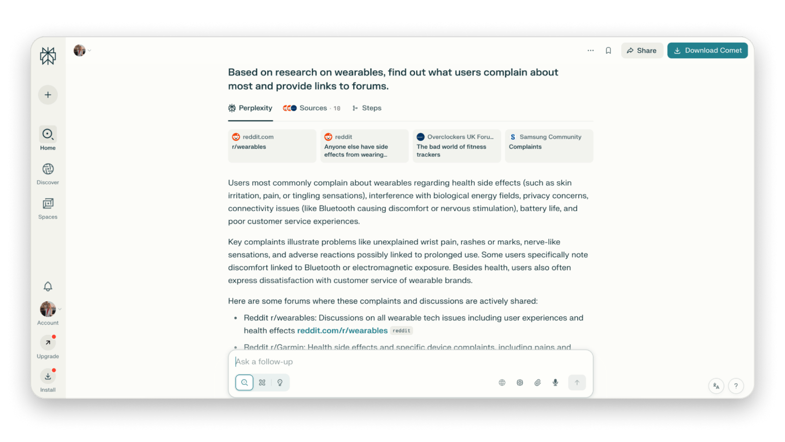
When I need to research topics for my blog or startup, Perplexity provides AI-powered search with citations. Unlike ChatGPT's general knowledge, Perplexity searches current sources and shows me where information comes from.
I use Perplexity to gather competitive intelligence for my startup and research emerging trends for blog articles. The cited sources let me verify information and dive deeper when needed.
Best features:
- AI-powered search with source citations
- Current information from web sources
- Follow-up questions for deeper research
- Academic and news source prioritization
- Export conversations for reference
Pros:
- Faster than traditional search engines
- Summarizes multiple sources into coherent answers
- Free tier includes substantial usage
Cons:
- Still requires verification of AI-generated summaries
- Pro features require a subscription
Pricing: Free or from $20/month.
Spellar AI: Meeting transcription and insights
Best for: Professionals, managers, journalists, PR specialists, marketers.
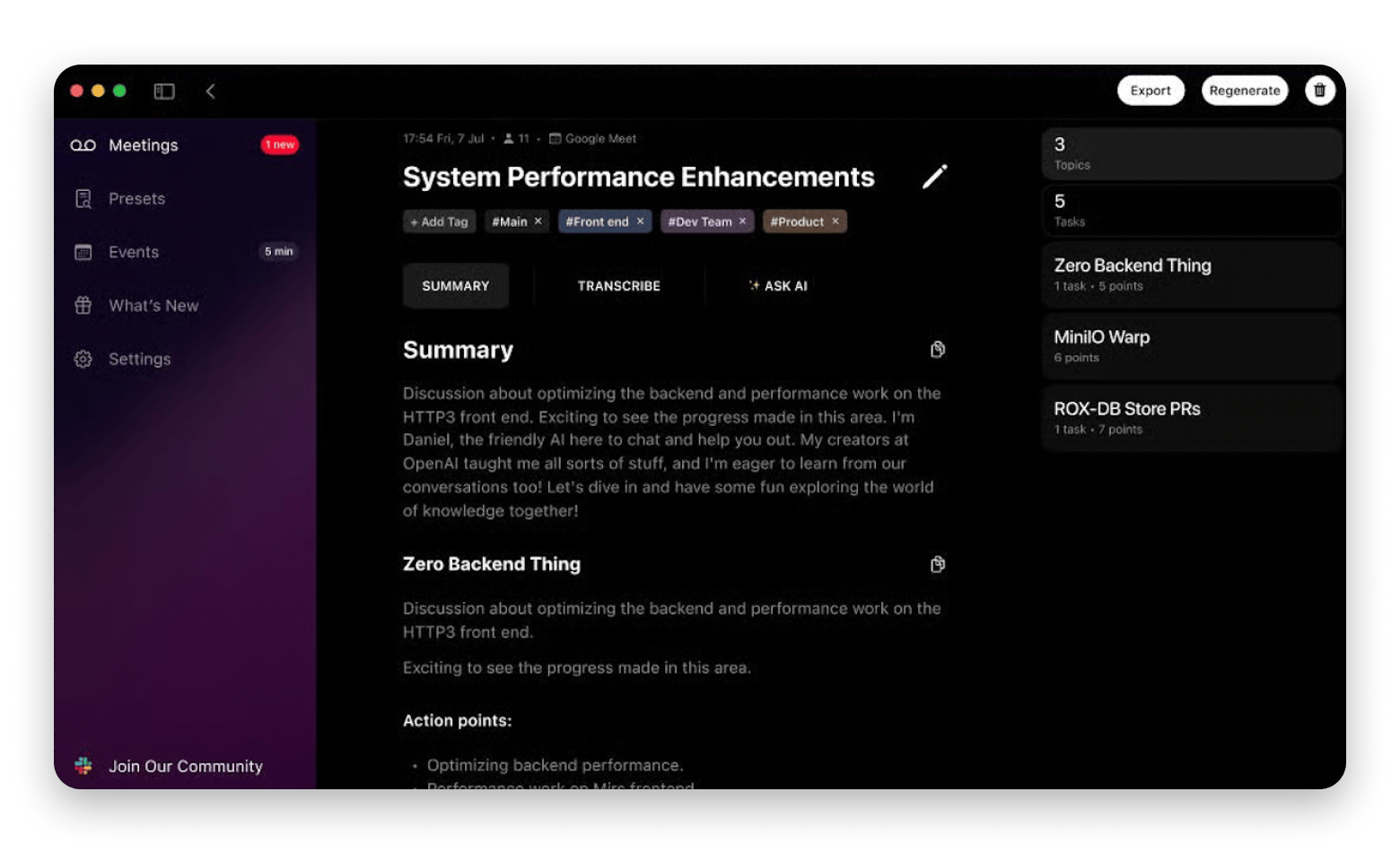
Instead of frantically taking notes during interviews for media or blog articles, I use Spellar AI, which transcribes my meetings and automatically extracts key insights.
For me, who used to spend at least 3 hours transcribing interviews, this is a game-changer!
I also use it during team meetings. I appreciate that I get a summary with key decisions and assigned tasks. The automatic action item extraction has saved me from missed follow-ups multiple times. I also combined Spellar AI with Miro to automatically export summaries.
Best features:
- Automatic meeting transcription
- AI-powered action item extraction
- Meeting summaries with key decisions
- Speaker identification
- Integration with popular meeting tools
Pros:
- Extracts action items from discussions
- Searchable meeting archive
- Improves meeting focus by eliminating manual note-taking
Cons:
Accuracy varies with audio quality
Pricing: Available on Setapp, a platform with 250+ apps for Mac, iPhone, and iPad. Install as many apps as you want for the price of a single subscription.
Final words: How to choose the best free app for productivity
After testing dozens of productivity tools, I've learned that the best free productivity apps often match paid alternatives.
Before choosing an app, identify your actual pain points. If you're missing tasks, you may need NotePlan or Todoist. Losing track of time? Try Timemator. To avoid drowning in emails, you need a smart email management app like Spark Mail and Slack for centralized messaging. If you spend too much time on repetitive tasks on your Mac, try Eney.
Setapp provides access to more than 250 apps that help you work more productively and automate routine tasks. Start with a 7-day trial and experience first-hand getting professional features without juggling multiple expensive licenses.
FAQ
What are the best free productivity apps for Mac?
Among the best productivity apps for Mac are Eney, NotePlan, Timemator, Ulysses, iStat Menus, and CleanMyMac, all available for the price of a single Setapp subscription. Depending on their goals, users also praise Todoist for task management, Slack for team communication, Clockify for time tracking, ChatGPT for AI assistance, and Perplexity for research.
Is Setapp worth it for productivity apps?
Yes, Setapp has a great collection of the best productivity apps, including CleanMyMac, Spark Mail, Timemator, Spellar AI, and 250+ more. Instead of paying for individual app subscriptions, you get dozens of apps, including all premium productivity tools, for the price of a single subscription.
What's the best productivity app for students?
Students will benefit from using Ulysses for writing papers and essays, NotePlan for task management, and Miro for collaborative brainstorming. Other top productivity apps for students include Perplexity for research and ChatGPT for explaining complex topics and generating ideas.
